Didn’t think I’d get a block done again this month, but I squeaked in!
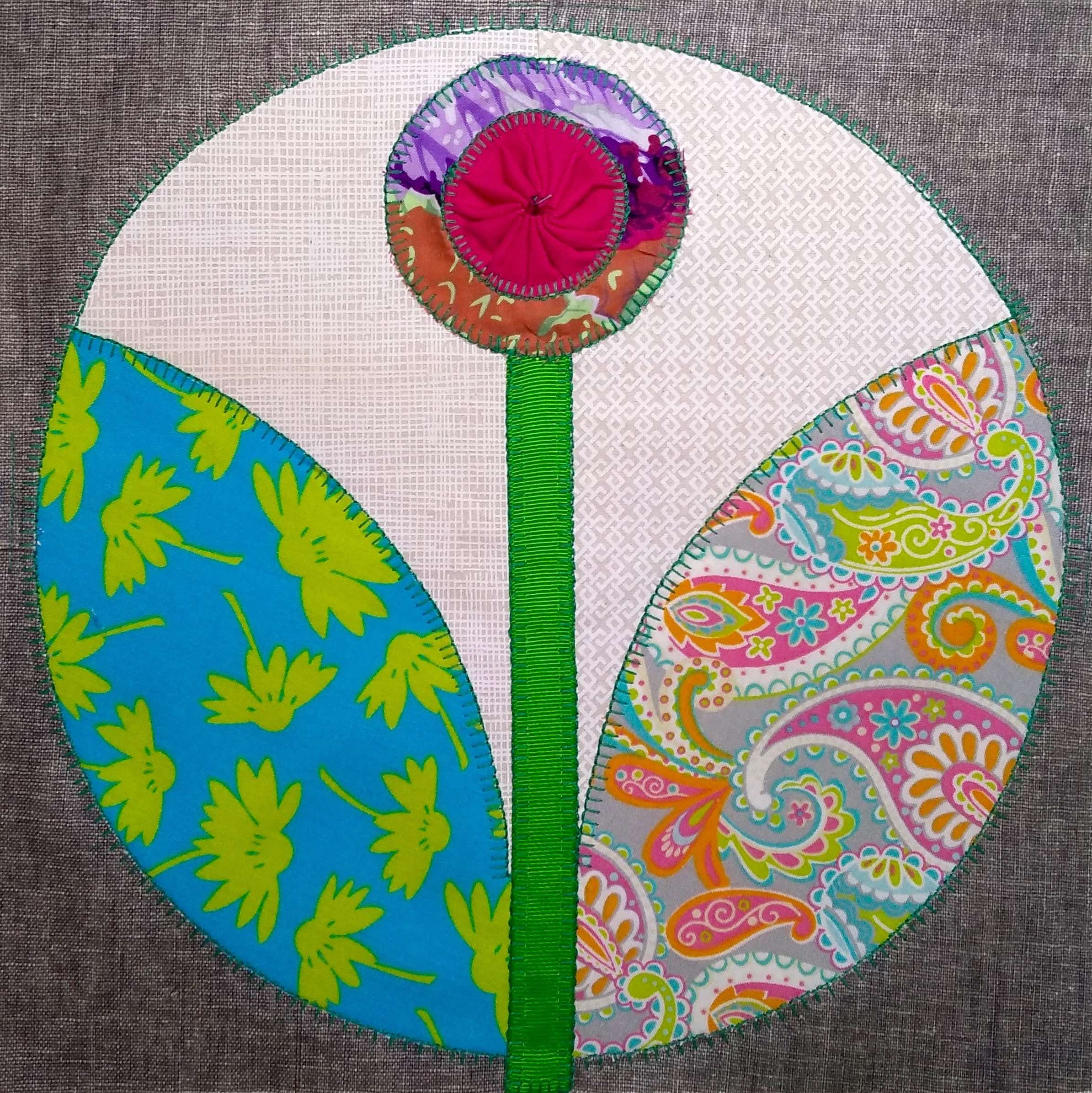
Block 18 is back to my bright, colourful preferences. Some might say too bright. I’d say they were fuddy-duddies. What’s wrong with multicoloured paisley mixed with bright green on bright turquoise, with a pink and purple flower? It makes me smile.
I really do need to set them all out some time soon to check for colour-gaps. I know, I know, I said that last time, but I really have had one or two other things on my plate.
Bee, Myself and I is a forum for ‘selfish sewing’; any stitchery which is purely for pleasure and not to a deadline or for anyone else. The original concept belongs to Carla of Granny Maud’s Girl. To find out more, you can click through on either her blog link, or using the button a fair way down in the left hand column of this blog.
Until next time…

🎶 All things bright & beautiful 🎶🎶
Exactly. The two things are inextricably linked in my mind.
The brighter the better- it’s gorgeous.
I think so too. It makes me cheerful just to look at it.
I love the right colours and you always manage to get a good balance with sashing and borders to bring it all together so it will be fabulous!
I do make a conscious effort to make unlikely combinations that just work. I really don’t want anything too ‘tasteful’ or matchy-matchy, and this inevitably leads to some fairly eye-searing results, which I love against the grey.
When I was first married (early 70’s) there was a fashion to have EVERYTHING matching – curtains, tea set, oven gloves the lot. I never thought it looked good. Now I realise that things like patchwork in a mix of colours go with anything as long as there is enough neutral to calm them down.
And neutral need not mean white, cream or beige. I’m very fond of dark navy or grey for that purpose too. It’s just a resting place for the eyes.
Very true
There is no such thing as too bright! I love it!
I agree: for flowers, nothing is too bright!
It’s perfect. Anyone who thinks it’s too colorful simply has different taste. And yours is better. 🙂
Exactly. Life is too short to be beige.
Not too colourful at all – although I wouldn’t wear it 🤣
Hmmmm. I probably would, but then I do live in the tropics and the light demands bright colours. Anything too tasteful just looks washed out.
anything that gives you a smile and makes you happy. by the way, how is the toe?
That was definitely a hoppy one! The toe is…. still there. I can’t say it’s a lot better, because it isn’t, but maybe it’s a little less insistent!
Love it! Maybe my thoughts are coloured because I have a bag I made from the same lime green and aqua fabric.
An excellent choice! Hard to lose, too….
Lovely, bright colours!
Do take care 💕
Time will take care of it, I just have to avoid knocking it again. Glad you like the block!
It makes me happy to look at it too!
That’s all I hope for 🙂
Love the cheerful and chirpy colours you have there…
The colours are daring the sun not to shine. It seems to be working…
Beautiful bright block, and you may convert me to paisley – one day
That paisley especially is gorgeous. I have a big soft spot for paisley in pale colours, I admit.
I don’t think it’s too bright! Another beautiful one done.
I’m loving how all the Parterre blocks are showing the world a cheerful grin!
Gorgeous, as usual 🙂
Thank you, lovely, I appreciate your unfailing encouragement 🙂
I love bright colourful quilts, I just struggle to do them myself! I shall just admire your beautiful blooms instead. Anyway, nature puts all colours together and it always looks fab, just like this block 🙂
It’s funny, because I like my rooms to be pale and peaceful, but then I fill them with lots of colour in the form of pictures, books and cushions and quilts. I wonder if that makes me a pastel person with a colourful streak or a colourful person with a pastel streak!
I really love your Parterre blocks! This one is beautiful!
I really love this one too. But I love most of them; it’s very hard to pick a favourite.